Brand Identity
LOGO RESTYLING
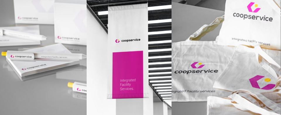
The Coopservice logo was created in 1991 together with the new cooperative. It has accompanied our growth in these 28 years of activity and has spread throughout the facility services market, making itself appreciated and recognised on the uniforms of our operators and on the vehicles in service. The dynamic context and changing market conditions have led us in 2019 to embark on a journey to make our image more attractive and distinctive.
In designing the restyling of our logo, we wanted to maintain the naming and recall our identity in the graphic design to ensure continuity with an image well known to users and the market, while seeking a renewal to make our logo more modern, incisive and appealing. Our foundations are solid; our identity is precise and determined, highly distinctive compared to our competitors.
That's why we've kept our corporate colours, albeit in warmer, more vibrant tones, because they are unique and stand out from our competitors. Instead, we completely redesigned the logotype and chose a clear, visible and contemporary font. Together they create a simple, memorable, versatile and very flexible logo.

Concept
At the heart of the concept we wanted to maintain a strong link with our distinctive values: the centrality of people and our cooperative identity; the propensity for continuous innovation; environmental sustainability and corporate social responsibility.
The combination of these elements has resulted in the new brand, which has the ambition to tell the story of who we are: people of value, capable of designing innovative solutions to effectively meet the needs of our customers, seeking ever greater environmental and social sustainability.
Discover on the new blog THINK MAGAZINE blog how values, emotions and transparency have guided the graphic restyling of Coopservice.
PEOPLE

People teaming up and looking after each other - what does that make us think of?
There are iconic images that cannot help but come to mind: like a group of women and men in a circle with their hands outstretched towards each other and on top of each other.
And so the circumference fills in and becomes a full form, a dot. A universal form of perfection and harmony.
INNOVATION

Energy, technological innovation: we are used to seeing them represented through the use of the arrow.
Because it gives the idea of movement, of movement in place.
After all, in the information and big data society, how many times have we heard about digital highways?
Innovation is progress, going further, movement.
SUSTAINABILITY

Acting in pursuit of maximum environmental sustainability is a responsibility that each of us has towards future generations.
For a company like ours, which operates in the field of energy efficiency, heat management, professional cleaning and special waste management, it is much more than this: it becomes an integral part of the company mission, part of our identity.
People, Innovation and Sustainability come together to give life to the new Coopservice logo, in an enveloping design that recalls our initial, the letter C.
Which is also the C of cooperation, the C of community.
Brand Identity